ESA is just around the corner, and many of us are gearing up and trying to figure out a schedule to cover all the talks and people we can pack in. ESA is a big conference and there’s far too much for any one person to see. In the end, everyone experiences a different part of the elephant. However, I thought it would be interesting to take a look at the big picture, and examine the ESA program as a whole to see what could be learned from it. This is the first of (maybe) several posts where I use some basic text-mining tools to explore the content of the ESA program.
First, what are the most common terms in the ESA program?

Few surprises here. “Species” would have been my guess for the top. “Plants” are probably on top because ecologists usually refer to animals by various sub-groups. The rest are fairly ho-hum: ecology and science-y words.
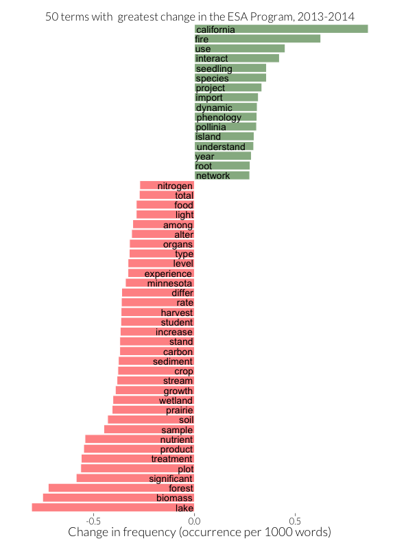
It’s more interesting to ask how the topics at ESA change from year to year. Below I show the terms whose use in ESA abstracts changed the most between 2013 to 2014:

This paints a much more interesting picture. The rise of California and the fall of Minnesota make sense given the change in the meeting’s location. But we can see the influence of landscape on topics as well. We see fewer words associated with freshwater ecosystems, prairies, and forests this year, and more associated with fire and other plant systems. Also, we see a difference in the kinds of ecology in the program. This year there are fewer words like “biomass” and “nutrient” - those common in ecosystem ecology - and more like “pollinator”1, “phenology”, and “network” - those associated with the study of species interactions.
It’s possible that these changes are due to changes in what’s popular in ecology, but it is also likely that many of the concepts captured in these terms - ecosystem, community, and landscape ecology - are influenced by region. After all, an ecosystem perspective is likely to dominate in the Midwest, where an abundance of lakes have been important in the research of freshwater nutrient cycling, and a landscape perspective may be important in California, which has such heterogeneity of habitats. This is a pretty good argument for keeping ESA’s location moving, so that no regional perspective dominates every year.
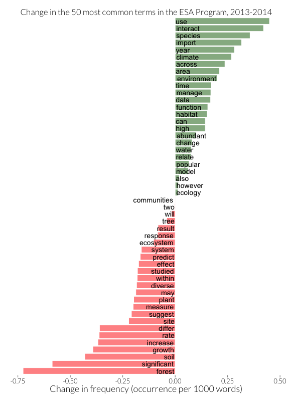
These are the biggest changes, but have the biggest topics changed? The plot below is similar to that above, but instead of plotting the words with the greatest absolute change, I plot the change of the 50 words that are most common across both years:

This is somewhat less clear. If one squints, one could argue that there are more words associated with species interactions, environmental change, and management at the top, and more words associated with forests at the bottom. Words in the middle (“ecology”, “community”) are consistently popular across both years. Finally, perhaps significance is falling out of fashion?
That’s just a quick first pass. I haven’t yet thought much about how one models these data to understand effect sizes and significance. I welcome suggestions for further analyses and better ways to plot/organize this data. Check out this repository on github for the code that generated these plots and how to grab the ESA program text for your own use. See you in a few weeks!
P.S. While messing with the ESA program text, I also created @esa_titles, a twitter account that re-mixes ESA talk titles. Have a look for talks you wish you could see. :)