I gave a short talk today to the [Davis R Users’ Group] about ggplot. This what I presented. Additional resources at the bottom of this post
ggplot is an R package for data exploration and producing plots. It produces fantastic-looking graphics and allows one to slice and dice one’s data in many different ways.
Comparing with base graphics
(This example from Stack Overflow)
First, get the package:
Let’s say we wanted to plot some two-variable data, changing color and shape by the sub-category of data. Here’s a data set:
data.df <- data.frame(Plant = c("Plant1", "Plant1", "Plant1", "Plant2", "Plant2",
    "Plant2"), Type = c(1, 2, 3, 1, 2, 3), Axis1 = c(0.2, -0.4, 0.8, -0.2, -0.7,
    0.1), Axis2 = c(0.5, 0.3, -0.1, -0.3, -0.1, -0.8))
Using normal R graphics, we might do this:
color_foo <- colorRampPalette(c("lightblue", "darkblue"))
colors <- color_foo(3)

plot(range(data.df[, 3]), range(data.df[, 4]), xlab = "Axis 1", ylab = "Axis 2",
    type = "n")
points(data.df$Axis1, data.df$Axis2, pch = c(1, 2)[data.df$Plant], col = colors[data.df$Type])
legend("topright", legend = c("Plant1", "Plant2"), pch = 1:2)
legend("bottomright", legend = c("Type1", "Type2", "Type3"), pch = 20, col = colors)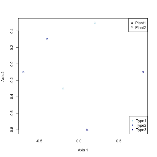
With ggplot, you just do this:
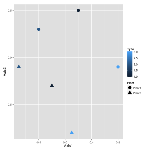
And it looks much better!
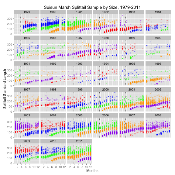
But ggplot() really shines when you have a lot of data. Here’s an example of some fish survey data that I produced with it:
Tutorial
ggplot is best used on data in data frame form. Let’s look at a data set already in R, this about the sleep habits of different animal species
##                         name      genus  vore        order conservation
## 1                    Cheetah   Acinonyx carni    Carnivora           lc
## 2                 Owl monkey      Aotus  omni     Primates         <NA>
## 3            Mountain beaver Aplodontia herbi     Rodentia           nt
## 4 Greater short-tailed shrew    Blarina  omni Soricomorpha           lc
## 5                        Cow        Bos herbi Artiodactyla domesticated
## 6           Three-toed sloth   Bradypus herbi       Pilosa         <NA>
##   sleep_total sleep_rem sleep_cycle awake brainwt  bodywt
## 1        12.1        NA          NA  11.9      NA  50.000
## 2        17.0       1.8          NA   7.0 0.01550   0.480
## 3        14.4       2.4          NA   9.6      NA   1.350
## 4        14.9       2.3      0.1333   9.1 0.00029   0.019
## 5         4.0       0.7      0.6667  20.0 0.42300 600.000
## 6        14.4       2.2      0.7667   9.6      NA   3.850
Now, lets start with a basic plot. Let’s create a scatterplot of body weight against total hours sleep:
a <- ggplot(data = msleep, aes(x = bodywt, y = sleep_total))
a <- a + geom_point()
a <- a + xlab("Body Weight") + ylab("Total Hours Sleep") + ggtitle("Some Sleep Data")
a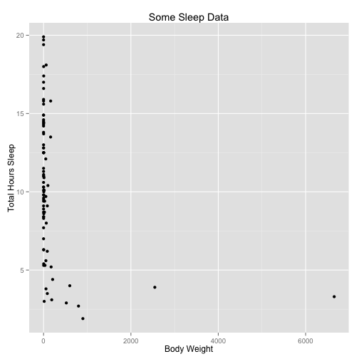
Let’s parse what we just did. The ggplot() command creates a plot object. In it we assigned a data set. aes() creates what Hadley Wickham calls an aesthetic: a mapping of variables to various parts of the plot.
We then add components to the plot. geom_point() adds a layer of points, using the base aesthetic mapping. The third line adds labels. Typing the variable name a displays the plot. Alternately, one can use the command ggsave() to save the plot as a file, as in
Now, one of the great things we can do with ggplot is slice the data different ways. For instance, we can plot another variable against color:
a <- ggplot(data = msleep, aes(x = bodywt, y = sleep_total, col = vore))
a <- a + geom_point()
a <- a + xlab("Body Weight") + ylab("Total Hours Sleep") + ggtitle("Some Sleep Data")
a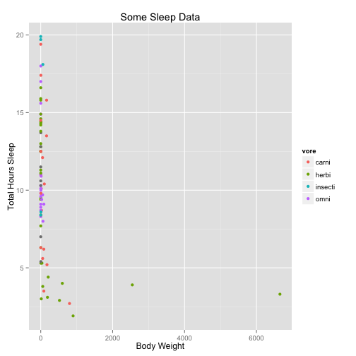
You can also use map size and alpha (transparency) to variables.
We can transform variables directly in the ggplot call, as well:
a <- ggplot(data = msleep, aes(x = log(bodywt), y = sleep_rem/sleep_total, col = vore))
a <- a + geom_point()
a <- a + xlab("Log Body Weight") + ylab("Fraction of Sleep that is REM") + ggtitle("Some Sleep Data") +
    scale_color_discrete(name = "Trophic Level")
a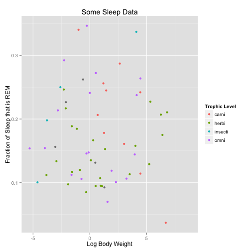
Within the geom calls, we can change plotting options
a <- ggplot(data = msleep, aes(x = log(bodywt), y = sleep_rem/sleep_total, col = vore))
a <- a + geom_point(size = 5)
a <- a + xlab("Log Body Weight") + ylab("Fraction of Sleep that is REM") + ggtitle("Some Sleep Data") +
    scale_color_discrete(name = "Trophic Level")
a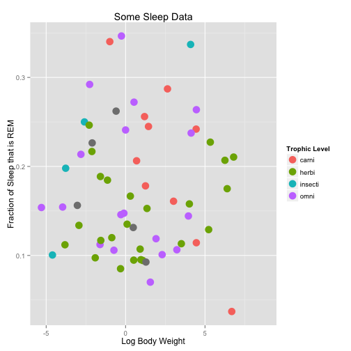
Another way to split up the way we look at data is with facets. These break up the plot into multiple plots. If you are splitting the plot up by one variable, use facet_wrap. If you are using two variables, use facet_grid.
a <- ggplot(data = msleep, aes(x = log(bodywt), y = sleep_rem/sleep_total))
a <- a + geom_point(size = 5)
a <- a + facet_wrap(~vore)
a <- a + xlab("Log Body Weight") + ylab("Fraction of Sleep that is REM") + ggtitle("Some Sleep Data")
a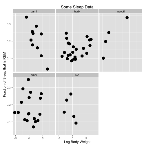
a <- ggplot(data = msleep, aes(x = log(bodywt), y = sleep_rem/sleep_total))
a <- a + geom_point(size = 2)
a <- a + facet_grid(conservation ~ vore)
a <- a + xlab("Log Body Weight") + ylab("Fraction of Sleep that is REM") + ggtitle("Some Sleep Data")
a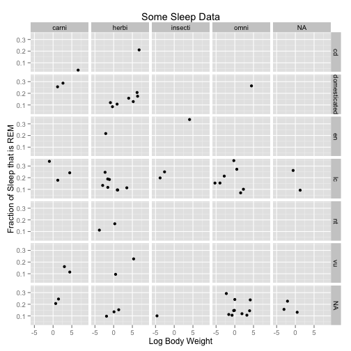
Let’s use a different data set to so line plots:
##         date   pce    pop psavert uempmed unemploy
## 1 1967-06-30 507.8 198712     9.8     4.5     2944
## 2 1967-07-31 510.9 198911     9.8     4.7     2945
## 3 1967-08-31 516.7 199113     9.0     4.6     2958
## 4 1967-09-30 513.3 199311     9.8     4.9     3143
## 5 1967-10-31 518.5 199498     9.7     4.7     3066
## 6 1967-11-30 526.2 199657     9.4     4.8     3018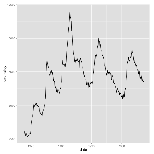
We can add statistical transformations to this series, for instance:
a <- ggplot(data = economics, aes(x = date, y = unemploy))
a <- a + geom_line()
a <- a + geom_smooth()
a## geom_smooth: method="auto" and size of largest group is <1000, so using
## loess. Use 'method = x' to change the smoothing method.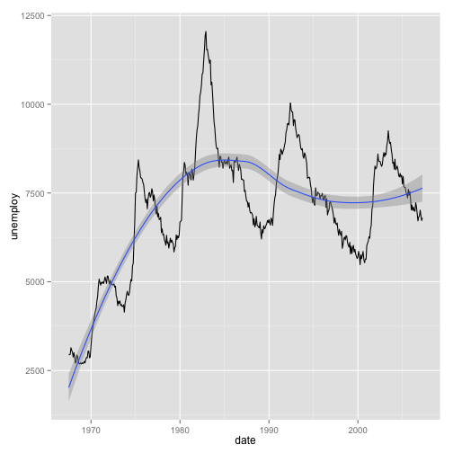
Some resources:
- The main ggplot website, including documentation and excerpts from the book
- Note that that the full book is not available at that website. However you can get it online via the UCD library here
- The Learn R blog has some great examples.
- A quick reference website that’s easier to understand than the documentation
- A quick intro on a blog
- A key to the many obscure display options
- The latest version of ggplot has an updated “themes” system by which you can modify many aspects of the cart just by adding
+ theme_x(). Details here and updates in the new version here - Some nice themes and an XKCD theme!